Wednesday, May 26, 2010

Platon and Irving Penn

Paparazzi Prints:
This picture is a paparazzi picture of children playing when the teacher is not around. The young un-named girl got caught on camera spraying one of her classmates with water, after being told not to! This scandalous move from the girl is now on film. Watch out or you could get caught!


This picture is of two women, secretly talking about the cute man at the table next to them. One of the women doesn't want him to notice their interest. She is covering her face in hopes he won't see, yet she is making it all the more obvious! Maybe she should just go over and talk to him, rather than shying away.


Irving and Platon Interviews and Prints:

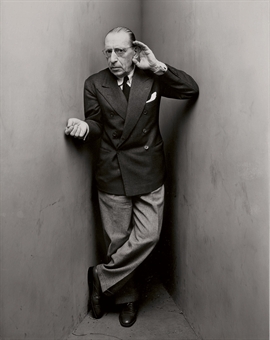
Irving Penn, renowned photographer, known for his fascinating portraits in black and white, and depicting people as mere shapes. He sees, geometrically, how people can look, and bases his pictures on these shapes. He also adds props sometimes to help with this. He may add bulky carpet, chairs, fabric from the model’s clothes, or even the model’s body, to turn his work into art with shape and structure. I had the chance to interview Mr. Penn to talk about a new portrait of his. It is of an older man, standing in a corner of a room, with one hand in an awkward fist, and the other cupping his ear. Irving Penn has so much to portray just in the body positions of his models.

The picture that I am talking about is one of several more portraits with the model placed in a make-shift corner. Penn elaborates further: “I started using this technique when I shot some portraits for Vogue in 1948. I would create a corner for my model by pushing two white panels together. This created a very sharp corner for the model to stand in. Some of my models, like Georgia O”Keefe, felt very constricted in the small space and felt like it took away from them. It made them feel unlike themselves. Some used it to their advantage and fit the structure with an ease, which gave the picture more of a calming mood.”

“A good photograph is one that communicates a fact, touches the heart and leaves the viewer a changed person for having seen it,” quoted by Irving himself. The kind of art that he wants to produce is the kind that changes people and what they get from the picture. We can definitely say that Irving Penn has achieved this through his lifetime of fabulous achievements. He has created a kind of portraiture that artists like Platon are changed from, and base much of their work on his style.

Penn’s work has been in Vogue magazines all around the world. He was also named one of “The World’s 10 Greatest Photographers” in 1958. His style is quite intriguing and creative for his time. Several photographers today owe him for thinking outside the box when it came to portraiture.


Final Print


http://www.christies.com/lotfinderimages/d50540/d5054050l.jpg


In the interview of his new portrait, Platon coolly tells me of how it all started for him. “Much of my influence came from my parents. My mother was an art historian, and my father was an architect. Much of our lives revolved around art. Although I took a different path with photography, I still learned a great deal growing up around this art culture.” Not only in his household did art teaching take place, but also at St. Martin School of the Art in Great Britain, and the Royal College of Art after that. In 1992, he won the acclaimed award of British Vogue’s “Best up-and-coming Photographer”, which shed light on how far this artist could go in the future. In this magazine, he was able to produce both fashion and portraits, allowing him to show off his versatile talents.

Some of his recent portraits display disproportioned people strewn against a white background, while the model has intense lighting on certain parts of their face. The people appear to be disproportioned in that someone’s hand is five times larger than their head. This effect if made by the positioning of the model’s body in respect to the camera; at an angle of the camera. One of his portraits is of Ray Davis, a musician. This portrait focuses on the distortion of his arms and plays this effect with his face. It truly is a modern twist on portraits. Platon is giving us more depth to the picture, by incorporating shadows and texture and shapes. This also gives the model, Davis, a very secretive and mysterious look. Much of Platon’s portraits are similar in style to that of the infamous Irving Penn. There is a parallel in the structure of the pictures: bold shadows and intense shapes and figures created by the models.

Platon has been taking portraits for almost 20 years now and has worked with some well known publications. To name a few: Rolling Stones, Vanity Fair, GQ, and The New Yorker. He has even done some advertisements with Exxon Mobile, Nike, Verizon, and Rolex. Just by looking at some of the people he has worked with shows his diversity and ability to adapt to his employer, whether it is an oil company or high top fashion.

Mr. Platon now resides in New York, working for the New Yorker. He has had a solo portrait exhibition at the Milk Gallery in the same city. The quote that Platon left me with at the end of our interview dealt with his outlook on his work as an artist: “I never publish anything that I am not proud of. For me, experimenting with different techniques helps me develop as a photographer, and can sometimes the outcome can blow you away.”


Final Print


Magazine Cover:


Final Print


Wednesday, February 17, 2010

Save the Children©

Diary Entry:
Save the Children is an organization that works for educating, and providing for children in countries where they are not given the necessities of life. For this contest we were to take pictures of universal education. I had a few ideas on what to take pictures of for
the contest. The theme was universal education. Somehow I had to capture this at my school. The universal part would be somewhat easy because my school has many people from different backgrounds. My ideas were to have a child sitting down reading a very large book, maybe twice his size. For my next picture, I wanted to have two children looking at a teacher when she is explaining something. My last one was to have one child helping out the other on a project. Though my final pictures changed from my original ideas, I was still able to try out some of my ideas as well as create new ones.


Theory Notes:

Inspi(RED)™:


RED is not a charity or a cause, but rather an idea. People buy their products and up to 50 cents of the profits go towards buying antiretroviral medicine to people
dying of AIDS in Africa. Some very famous brands have taken part in RED. Some are Apple, Dell, Converse, Gap, and Nike.

Their media supporters are Facebook, Vanity Fair, HBO, and Elle are a few. These are the mediums in which they get their message across.

Also, here is a video of some famous athletes, promoted by Nike, advertising their new tennis shoe laces that support their fight against AIDS in Africa.
Nike RED


Gap Inc.:
Gap Inc.'s rules to succes aretat they replace their stock very quickly, and their prices are always guaranteed to be low. Gap knows how to stick to the basics, same jeans with few styles and shirts, in several different colors. Much of the success and growth of the company was due to the advertisement by Levi Strauss, since Ga
p used their jeans in their stores. Levi Strauss actually provided all of Gap's merchandise in the beginning.
During 1973, Gap started producing its own products, and using
other brands, along with Levi. A few years after, in 1975, he Gap stores ha
d $100 million in net sales. There was a small slump when the owners, the Fishers, were trying to expand on more than just their jeans and shirts, as well as attempt to appeal to an older age group. After a while, they were liquidated, because it didn't make much of a success.
Soon, Levi jeans and apparel were being sold in department stores, and people no longer had to go to Gap Inc. to get it. They needed something new and
fresh
to attract attention again. Gap's own personal brand gained about
45% of their total sales in 1980. Although the sales were good, if they were to stay up to speed, they would have to have an image, with just Gap as the label. In the late 1990's Gap became too "trendy" and decided that it needed to go back to the basics, bas
ic tees and jeans that is. The did this by using ads in commercials on their Gap Easy Fit Jeans with celebrities.


Not much after that, they began the online gap.com, where shoppers could purchase clothes online. The next year sales went up to $9 billion and 356 new stores opened. From 1984 to 1989, the company grew 24,000 percent. When the new millenium hit, sales dropped by 5%, and by 2001, there was a $7.7 million loss. A writer from the National Post said it was because they lost touch with the customer and they didn't have the same cheap prices people had once been used to. By 2002, the company had changed to focusing on customer research, new advertising, and closing some stores down. The net income was brought back up yo $477 million. Though the economy has since, made the people of Gap somewhat skeptical, they are overall very confident in their name and their time-lasting fashion.
Here, in this picture below, Gap joined with Red, and added some of that merchandise to its line.http://www.fundinguniverse.com/company-histories/The-Gap-Inc-Company-History.html


picture link


Printing Composition:


If one is quiet and still, they may see the great lessons that are being instilled and practiced by children around the world.
This picture shows a young girl, ready to work and learn new things that will be beneficial to herself, as well as the people around her.

A young mind that aspires to learn is the greatest gift a child could give to their community and the world.


Image Bank +:
Abbie Trayler-Smith was born in South Whales in 1977. She went to college in London, for a degree in law, and picked up photography. She took pictures for the school newspaper. By 1998, she got a job working for the Daily Telegraph. The amazing thing about her, is that she taught herself everything she knew when she got the job. Much of her work today, consists of anniversaries from fighting or natural distasters. For example, Pearl Harbour anniversary, in Hawaaii, and the conflict in Darfur. She has clients, but spends a lot of time on her own projects. Here is a picture from one of her documentaries that I find says a lot about the place she photographed this: Yemen. http://abbietraylersmith.com/biography.html

This is a picture of the women in Yemen going to school. They can only have a teacher that is a woman because of the status of women and men there, and how men are looked on more highly than women. But I see that the fact that the women are getting education is a step in the right direction. Also, what is interesting that the women, even when they are not out in the public around men, they still have to keep their faces covered, around other women. This picture says so much more than the women of Yemen getting an education. It gives thought to what kind of society these women live in and the culture of the Middle East.

Monday, February 8, 2010

Traditional Regalia

Diary Entry:


For this project, I had to take pictures of cultures with regalia in it. Regalia refers to the regality, or the “look” of a person of royalty. This deals with the posture and the way that people are positioned in these portraits of regalia. For my first photo, I had to take a picture of my culture, in which I took of my Hispanic roots. For my second picture, I took a
Chinese fan and worked with that and the Chinese attire. Lastly, I took a picture of a militant, with the attire.

Theory Notes:

Regalia in portraits can be expressed or portrayed in different ways, depending on the time as well as culture. In a classical painting, for example Louis XIV during 1670, the family is in a group, but within that group there is a hierarchy. King Louis gets the crown, as well as the scepter and robe. His wife and other close family trickle down as you look at the picture from right to left. At the very front are the children, which have with them a harp and toys. There is also a painting in the painting of two smaller children. Maybe they had died, so to keep them in the family picture, they had a photo of them.


For the contemporary portrait of a royal family, I chose the British Royal Family, The House of Windsor. This picture has Queen Elizabeth II in the center, to show that she is the core or center of this family. On the far front left and right sides are
Princes Harry and William, along with their father Prince Charles. Behind them, are Duchesses, Dukes, Earls, Ladies, Countesses, and Princesses. Here there is also a sense of hierarchy, starting at the front, from core to the outside. Then everyone else behind is a member of the Royal House.


Printing Compositions:
This is my first print, which deals with the Chinese culture. In my picture, there is a conserved factor that adds a nice touch to the picture. The fan and the shirt is a big part in which lends to what culture it is. I used a Canon digital EOS 20D, with a 28-75 mm 1:2.8 MACRO for all of my pictures for this post.


My next print refers to my Hispanic culture. The purse was a key accessory, because I actually got it in Guatemala, where my father is from. What the girl is wearing is traditional to what many people in that region may wear, a simple shirt with a colorful skirt (falda). I added the regal-ness to the picture by the model's stance in the picture.


My final print is part of the American culture. It is a military uniform.This symbolizes patriotism of a country, and my model is standing at attention, which shows regality in the stance of a militant.


Image Bank:


Hiroshi Sugimoto –

Hiroshi Sugimoto took photos of waxworks by Madame Tussaud. He recreated these lifeless figures and made the portraits look as they may have back in the 15th century. This picture of Henry the VIII shows a sense of power that is known by everyone. Sugimoto was born in Tokyo, Japan. Many of his pictures are taken using a silver-print method in printing. He uses his keen eye to make everything seemingly perfect, as he takes a great deal of care with his pictures.


Steen Brogaard –
This is a picture of Denmark’s Prince Joachim and Princess Marie. Here there is a sense of who is in charge, which would be the Prince, for he is standing and it shows that he has dominance. Also, his military attire adds to his power. The princess is quite dainty and looks elegant with her sitting and her hands in a proper position. Steen Brogaard, who is a Danish photographer, took this picture. He has taken several pictures of the royal family and is well respected for his work. He also took picture of Prince Frederik, for his biography, Frederick, Crown Prince of Denmark.


Annie Leibovitz –
This picture was recently taken of the President of the U.S. and his family. Although he is not royalty, he and his family are known in the public eye. This is a picture where the family seems very approachable, even though you know that the President is known as a very important man. This sense of regality is different than the one of the prince of Denmark, but still shows a sense of power.


Image Bank +:
William Hogarth –
William Hogarth was born in 1697, and lived until 1764. Born in London, he was an apprentice to a goldsmith. Later he became known as a painter, and one of his famous paints was A Rake’s Progress, drawn in 1735, which contains a set of 8 paintings in total. The pictures show you certain snapshots of a man that goes by the name of Tom Rakewell. Some of the scenes have him preparing for his father’s funeral, gets saved from prison, and finally, in the last scene, ends up in a mad house.


In 1745, Hogarth made another set of paintings, this time 6, with the title Marriage-`a-la-mode. These prints were used to tell a story of a marriage gone all wrong. The end of this picture story also ends in death of the main character. Also throughout his paintings, he started making life-sized portraits.


Annie Leibovitz –
Annie Leibovitz has been taking pictures for the past 30 years. She is from Waterbury, Connecticut, and attended the San Francisco Art Institution. She first went there for painting, but after going to Japan with her mother, she discovered that she wanted to study photography.


In 1970, she started working for Rolling Stone magazine in San Francisco. On her first out-of-town assignment, she took a picture of John Lennon and it ended up on the front cover of the magazine. By 1973, she became Rolling Stone’s chief photographer.


In 1982, the art director of Vanity Fair asked her to contribute to the magazine. By the next year, she permanently started working for the magazine. Also, her first book, self-titled, became published.
She later starts working for Vogue in 1998. She has another book published called Women.
Annie met Susan Sontag at a photo shoot for Sontag’s book, Aids and It’s Metaphors. From there, they began a 15 year friendship that lasted until Sontag died of cancer. After her death, Leibovitz put together pictures of Sontag, even when she was ill, and published the in A Photographer’s Life: 1990-2005.


Annie Leibovitz has an amazing eye for the detail in a picture, and she knows how to bring the personality of the person she is photographing in the picture. Also, her most recent picture with President Obama is an example of a “casual” regal picture. She can create a very nice picture, while still having the wholesomeness that people expect to see from the President and his family.

Thursday, December 10, 2009

Film Stills Recreation

Diary Entry:

For this project, I had to re-shoot twice. The problems that I had with the first shoot was that the prints all turned out grey and were frustrating to work with. I was only able to get one final print out of my first shooting. So I, along with 3 other people re-shot. From there I had to work with filters. I started out with the most extreme: 5 filter and 2.8 aperture. From there I changed the aperture, filter, and time around until I could get a decent contrast in my pictures.
This was not one of my favorite projects. I’m not too fond of taking pictures with the set up lighting. I like dealing with natural light rather than for it to be set up. But, this was a good project in knowing where the light is coming from in the picture, how many light sources you need to use, and at what intensity.
My final prints were somewhat to dark, but it was the best I could get with the negatives. I used filters a lot in 2 of my prints. I am not fond of using them either, but it gave me a better understanding in how they work.


Theory Notes:

His Girl Friday – Howard Hawks (1940)

This film has Carry Grant and is from 1940. This picture is similar to the one I have with three people sitting down, two of whom are looking intently and smiling at the person on the far right. The same thing is happening in this film still. Some limitations with this movie is that it is in black and white. Not very many people were working with colored film, but they were past the stage of the “Talkies”, where the audio of the movie wasn’t there. But, the audio during this time was still going through development in technology and the clarity in the audio itself.


Marnie – Alfred Hitchcock (1964)
This film has the actress Tippi Hedren in it. This picture is similar to mine in that they both have one person in it. Also the light that is on them is similar. The light is lighting up the front of the face and the side of the face. The 1960’s focused a lot on cultural and social mayhem, going against the status quo of society. Also realism came into play, and directors worked with changing the movement of the camera.


To Save a Life - Brian Baugh (2010)
Though this film is not out yet, it is still a new film. This film in relation to the 40’s and 60’s is much more advanced than then. In filming, they can use green screens to dub in an intricate background that may be hard to film in. This picture is similar to mine with two people and the position of the two people. The first one has her head facing the person who’s face you can see.


Printing Compositions:


1. Light on his head and hair to show the light coming down.
2. Lighting from the far right side allows for light to appear like it is coming from the side, casting light more on the right side of the body.
3. Light also here (on his shirt). The light is coming down from the top right corner of the image.


1. Overall positioning of the three models is similar to the film still; all close together with a little bit of space in between each other.
2. The girls are positioned so that Katlynne, the older woman in the film still, is slightly in fromt of Jenny, the younger girl in the film still.
3. Soft lighting over all three faces. The light is somewhat harder on the man’s face, in this case Javier.


1. Light is coming from the back, behind the models. There is also lighting n the girl’s head; in my recreation, the girl is Barbara.
2. There is lighting here as well (on the man’s ear), you see a minimal amount of skin on the man, in my re-take, Fabrizio.
3. Light on the woman’s forehead and side of her face, due to the light coming from behind.


Black and White Prints:

My first contact sheet was only useful for my first print. The rest of the pictures were too grey to use. I also had to have different times and apertures for the negatives. The negatives with one person was 16 aperture and 11 seconds. The other two set of negatives had a time of 3 seconds with 4.5 filter and 5.6 aperture.
My second contact sheet was more in successful with my final prints. The final time was 5 seconds at 11 aperture. Though I didn’t need a filter for the contact sheet, I ended up needing one for each of my final prints from it.


This print was quite easy in developing and didn’t give me much trouble. The cropping may have been the only thing that was time consuming to fit the paper. The final time is 27 seconds with 22 aperture.


My second print came from my second contact sheet. The final time for this one was 2.5 seconds, with a 4.5 filter at 5.6 aperture. This print only took me one class to do.


My final print was my most time-consuming print. It was very gray, and the filter helped the contrast, but it was still difficult to get it at the right darkness. I had to work on this one, then go on to another one and come back to this one later. The second time, I worked with using extremes in filter number and aperture, and went from there. The final time for this one was 4 seconds with 3.5 filter ant 5.6 aperture.
Image Bank:
Strangers on a Train – Alfred Hitchcock
This movie was made in 1951, and Art Streiber re-created a film still of it for Vanity Fair. In this picture are Emile Hirsch and James McAvoy which portray the actors Farley Granger and Robert Walker. When comparing the actual still with the re-created one, the shadows behind both men’s heads are there. The lighting is very accurate, but the hand gesture of the second man isn’t there in the re-created still. Also not all of the props are there in the scene.


The Birds – Alfred Hitchcock
The new film shot for this movie was taken by Norman Jean Roy. Jodi Foster is taking the place of actor Tippi Hedron from 1963. In the second film still, there seems to be more light on the actresses face when compared to the first still. The lighting that is cast on the blue poles and the shadow that is on it looks quite accurate to the original one.


Psycho – Alfred Hitchcock
Mark Seliger took the film still for this Hitchcock movie. The actress that took Janet Leigh’s place in this picture is Marion Cotillard. Once again the lighting is right, where it is at the top left side of the woman’s head. Also, the water in the recreated still is going the same way as the original one. Also the facial expression helps it to look similar to the original film still.


Image Bank 2:
Mirjana Vrbaski -
Mirjana Vrbaski is a photographer that works at the Royal Academy of Art in Den Haag, The Netherlands. Her vision in a picture is that when someone looks at, it will take them back to a certain time in their lives. She doesn’t want her pictures to look too modern, but rather makes you ponder and think what time period it is actually from. Also, the picture should have a different meaning for every person. She mainly takes portraits. Before that in college, she started off taking pictures of abandoned buildings, but then turned to portraits. She has her boyfriend work with her, for she says he knows what she wants in a picture almost better than she does.
Her style is quite precise in that her pictures cannot look too modern or point to a specific date. Also for her backgrounds in portraits, she uses a bland tan looking color that doesn’t stand out too much. When taking pictures, she will first play around with the digital camera and get a look at the lighting on the model. Once she is satisfied with all of that, she takes her film camera and takes her final print. She uses 2 different film cameras. One of them can hold 16 negatives, and the other holds two, but is much larger. She uses the latter for large prints.
I was able to meet and work as Ms. Vrbaski’s model. I was very tense at first, but after her talking and explaining and just being calm, I was able to relax and feel comfortable with her. Her style is different in that again, it is very precise. One of her most famous portraits is named Girl and was made this year.


Mirjana Vrbaski is a great photographer and her preciseness and wanting her prints to be just so shows that she knows what she wants in a picture.